Archive for ‘Overviews: nonprofits’

January 31, 2011

No Excuses for Poor Signage

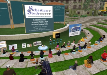
It was an honor to present concepts discussed in this blog on Friday to the Nonprofit Commons in Second Life. A wide range of organizations were represented by their avatars in the central arena. There to discuss signage, I reviewed the best reviewed here and discussed tips and ideas for how they can improve their signage overall. Although most of the organizations, unfortunately, design their own signs, there are still ways that they can improve by following some basic considerations. Hopefully they will grow enough where they can afford to give their group a graphic face.

Liane Sebastian virtual presentation

Sitting off to the extreme left, my avatar waits to make the next presentation. My title slide is up, a cube of my sign designs, and four examples of inworld books.

So here is a synopsis of the presentation that I made to them:

LESSONS AND SUGGESTIONS FOR VIRTUAL GRAPHICS:

Perhaps the biggest frustration for visiting any location in SL is to figure out where you are. How many times do you tp into a spot and it takes five minutes just to figure out if you are in the right place? On the assumption that I am not alone in this

In real life, my graphic design and publication practice primarily services nonprofit organizations. So naturally I have been studying the design of Nonprofit Commons. And because I write about design as a published author of print books and articles, I have been blogging about my discoveries and what I have learned here. I am thrilled to be asked to share my perceptions and hope that my comments are useful to you.

The most important thing any organizational director can do in their SL presentation is to take a step back and try to put him or herself in the shoes of the visitor. How easy is it to see the signage?

The most important concern, as your first face to every visitor, considerations that will help improve your presentation:

1.  Placement. It is better to have more smaller signs than a single large one. Many organizations place a sign above the door, causing the newly arrived avatar to have to look up. The first place to have a sign is where someone can see it at the landing point. Then, there needs to be one by the door. Finally, there needs to be one just inside. In NPC, it makes sense to also have one on the roof.

2. Clarity. Many signs are very hard to read. A good test is for how small it can be made and still be legible. Boldness in SL is very important because people move fast and look at images from a great range of distances and angles. Any image that doesn’t hold up misses an opportunity to grab.

3. Distinction. A simple, bold, and visually expressive logo combined with a unique color pallette works the best in helping to attract visual recognition. Consistency between visual components for an organization is achieved through a defined identity.

4. Welcoming. Beyond the placement, the more creative the greeting, the more quickly the visitor will become engaged. Visual techniques, modular content, special concerns, publications, events—these are all opportunities to entice.

5. Informative. Presenting a sign of more than a very short paragraph is presenting a sign that won’t be read. Four sentences maximum. It is better to have more signs with less on them than fewer signs with more on them. Also, psychologically, people always seem to read captions. So caption photos wherever possible. Make the content as visual as you can with a photograph, diagram, or chart.

Visiting all of the organizations in NPC, evaluating what you do visually and in marketing, I also learn more about how you operate, meet expectations, and fulfill your missions. My fascination with business is equal to my fascination for virtual reality as a publishing medium. Like blogs, websites, wikis, etc., Second Life has a role to play in the suite of communication tools. But what makes it much more special are the collaborations, personal friendships, and international stage.

November 2, 2010

Free Isn’t Free: the case against give-away graphic design

overview

Obtaining creative design is crtitical to an organization’s growth and success. As the world becomes more visual, design grows as a strategic investment. Generally an initial project sets up a graphic foundation that gains momentum and keeps implementation costs to budget. However, initial costs are paid for before ideas are fully developed and benefits reaped. This can make many clients nervous, especially those without experience. They are concerned both about choosing the right designer and also about selecting the best concepts. Some think these risks can be avoided by asking for initial ideas as part of the proposal and awarding the project to the group with the best. Or, they may take up offers for free work from a designer who isn’t busy or one that is willing to donate. There are forms of obtaining professional-level design without paying for it:

SPECULATIVE DESIGN is when creative concepts are required with a proposal without compensation. The assumption is that when comparing concepts from several sources, you reward a winner. The other contributors are dismissed, possibly with a presentation fee. You hope to end up with the assurance via example that you made the right decision.

FREE SERVICE is when the designer doesn’t charge for creative services. Motivations to give away work, however, aren’t usually in your best interests. A designer willing to give away work:
• wishes to get a foot in the door—wanting to grow the business into paid projects
• wants to build experience and expand into a new area, thus learning on your project
• needs work, is hungry, and doesn’t know any better (see my blog about why this is such a bad idea for designers to undertake)
• is willling to donate services but doesn’t understand pro bono contributions—trading for a non-monetary exchange (see my blog that gives more description).

Asking for speculative or free design is counter to your goals and undermines creative efforts:

spiral bullet1. Project parameters are not completely formulated when starting a project, especially when deadline is an issue. When you aren’t paying for the designer’s time, it is easy to be too casual in gaining initial consensus, identifying expectations, and defining the decision-making process. Rather, speculative work falls lower on the priority list for busy executives. To impress decision-makers into attentiveness, put money on the table. To begin a project without an agreed upon plan is to conduct a time-consuming experiment that falls apart through disorganization.

spiral bullet2. It is difficult to thoroughly brief more than one designer—solutions after one meeting will be superficial. Effective design results from a relationship that builds as solutions are explored. To place a speculative competition on completely equal footing means a serious investment in setting up the project with each—time that can be better spent in other ways after choosing the designer with the best rapport and portfolio.

spiral bullet3. It is a major challenge to compare concepts. Different designers don’t develop approaches from equal resources. Design approaches are based on very different capabilities, talent, and knowledge. Concepts may be presented like apples and oranges and ultimately not scaled enough to the unique assignment. It usually ends up that any presented concepts need a lot more work because new parameters surface.

spiral bullet4. Results are insufficient—there are very few documented cases where spec design turns out favorably without the in-depth commitment of a collaboration. The designer who wins generally has to begin again with additional specifications. In the end, it is a case of being penny wise but ends up being pound foolish.

spiral bullet5. Best efforts can’t be applied. The designer is unable to spend as much time as he or she could if getting compensated. Paying work must take priority. Few clients wish to have their needs be less important! And the most talented designers are too busy to undertake unpaid work. So the best talent for the project is not used. Also, while working on unpaid projects, a designer is forced, by limitations of time, to go with first ideas instead of exploring possibilities that results in ideas worth the most.

spiral bullet6. Designers don’t gain an in-depth understanding of the project. They can’t afford to build a background or gain the administrative support for worthwhile collaboration. There is no such thing as a good design without a good client—which means working together towards the same goals.

spiral bullet7. The competition arrangement is inappropriate for developing creative solutions. If there is a contest between several creative sources, then one or more groups will not get paid for their work. The purpose of portfolio reviews, proposals, and interviews is to differentiate one designer from another. Choosing rapport, trust in insight, and strong project approach is a better way to apply efforts than to gloss superficially over the important nature of informational communication.

Those who embark optimistically on finding such donations must beware that the results are not beneficial to their organizations. Design may seem easy to give away because ideas are tough to put price tags on. However, design—especially in its initial phases—is the most valuable of visual equity. Because this is the least tangible of the publishing phases, because it requires the greatest amount of market understanding, because it uses the greatest talents, and because it is the basis for all other initiatives, the design is the spark that sets the other processes in motion. It is a mistake to undervalue this service. Fortunes have been made through strong and communicative design approaches.

Perhaps Milton Glaser is one of the most famous graphic designers in the U.S. He said:
“In our society, we express our respect for work by paying for it. When we refuse to do so, we are expressing contempt for the work and the worker. In difficult times, the fundamental rules of human conduct are under attack in and out of business. The only appropriate response is not to allow our own sense of values and self-respect to erode in the face of it.”

October 28, 2010

Second Life: A First Glance at Nonprofit Graphics

overview

The power of first impressions is either ignored or overlooked. Perhaps the poor state of design in Second Life is due to myopia—no one can see his or her own face objectively. A stroll around the Aloft group in Nonprofit Commons is a lesson in visual frustration. (Because the 30 organizations there comprise about 1/3 of all nonprofit residents, I hope the other groups fair better in my upcoming analysis.)  Many have beautiful architecture and interior design. But the signage, the information, and the communicative power of graphic presentation is virtually ignored! This is so surprising when the resources for space and furnishing is a major effort (albeit a cheap one). Here is what I found so far:

Preliminary Evaluation of Graphics
30 Nonprofit Commons Aloft organizations:

spiral bullet1. Placement of signs is better than the average Second Life presentations. For 23 out of 20, isn’t too difficult to tell who is who, though camera work is necessary when the signs are placed too high. The most legible use several sign positions—outside of building, near the entrance, just inside, and prominent in every room. Redundancy is important. The most astute also place a sign on the roof of their buildings so that it can be found from the air. [photo of sign on roof]

spiral bullet2. Legibility is poor. Fully 1/2 of all the signs are difficult to read. Because the point of a sign is to be read, such oversight is hard to understand. Editing can be difficult for anyone wishing to tell a story. But the rules of visual seduction, brevity, and even composition are still necessary. Residents put hours of work into avatars to represent them with sophistication, yet make presentations that are difficult to comprehend! It makes me wonder both why they are there and what kinds of responses they have garnered. This is not to say that compelling signs will guarantee that marketing goals will be met, but there is a certainty that meeting them will be more difficult if communications are unsatisfying.

spiral bullet3. Images are crude. 3/4 use images from logos to illustrations to photographs. But unfortunately, less than half of those look amateurish. (If I investigate the websites of the same organizations, I wonder if I will find the same thing?) The best use the organizational logo, furthering identity recognition.

spiral bullet4. Poor informations signs. Those groups that have signs inside their spaces either overwhelm the visitor with too much or underwhelm with vague content. Most have publication offerings, links to websites and blogs, and videos of activities. How these are presented seems more of an after-thought rather than as strategic tools.

spiral bullet5. The honeymoon is over. Two organizations are gone. The others discuss concerns in the Friday morning conference. Having attended, it is a challenge are to be taken seriously in the business community. The novelty has worn off and expectations altered. Second Life’s role is now being defined for fundraising, presentations, education, and publications. It is a more direct form of communication with members that the belief in its future holds strong. But the idea of foot traffic is dashed. Instead, being event driven, what you put in is what you get out; it is no panacea.

spiral bullet6. Three are the best. They are worth visiting as examples of what to do right. I will review these three in more depth and investigate the components. For now, effective graphics are most used by:

American Association of University Women

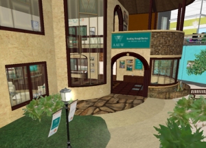
AAUW displays corporate approach to signage.

AAUW (American Association of University Women) hits all the bases with outside and inside signage. Although not very imaginative, their communication is clear, crisp, identifiable and inspiring.

KIVA loan organization

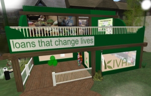
Kiva.org has signs that always provide orientation.


KIVA: Loans that Change Lives demonstrates a corporate design approach very effectively. Every view reinforces their identity and the viewer is never lost.

Project Jason presentation

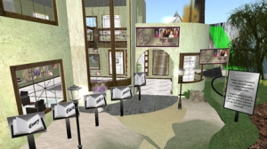
Project Jason expresses their mission visually.


PROJECT JASON: Assistance for Families of the Missing has a mysterious name so graphics become even more important to communicate mission. Very compelling in their portrayal of finding missing children, the visitor gets swept into awareness.

The more a viewer becomes engaged during a visit, the more inclined he or she is to drop a donation in the tip jar on the way out. The fundraising aspect of Second Life has only begun to be tapped. A much wider-reaching audience can augment the real life performance of these organizations. Graphics have a major role to play in compelling that audience to action.

the end

October 22, 2010

Evolving and Adapting: from regional to international

overview

Perhaps the best part of electronic publishing is the ability to change quickly. Yet once a commitmnent is made, it is usually a bad idea to redirect midstream. The test of a strong concept is the flexibility to expand or shrink, choose related forks in the road, or redefine parameters—and still carry out the original goal.

When I embarked on this Sebastian Study a few years ago, I envisioned a national study of nonprofit graphics—illuminating the best and those that could be great but aren’t. I have a large developed database containing 1500 nonprofits—the largest organizations based in the U.S.

Breaking down this mountain of analysis after my initial categorization (viewing 1500 websites took over two years), I chose to focus just on the Midwest (half of the total) first. Then I would follow up with the national evalutation. However, this planning was before I joined  Second Life. I have no choice but to set aside the national version in favor of reviewing the 80 international organizations with presence in Second Life. Last Friday, I attended their weekly meeting, and there were 50 avatars who showed up. Concerns discussed are real life concerns—they complain about the business perceptions that inhibit the acceptance of virtual business—the same tune sung by every new medium. But different than any other media, virtual reality brings all of the others together. Plus it is truly an international marketplace. I was surprised to learn that only 40% out of the 2 million avatars come from the U.S.

Jumping past the planned national study, I am going right to one that is international! Super-excited about the possibilities, I see virtual reality as the next evolution of not only communication, but of commerce. There are many bridges to cross before virtual reality really penetrates everyday business exchange. I hope to do my part in making sense of it. I just added a new page and category to this blog for the upcoming evaluations: “Virtual Reality: Birth of a New Evo(revo)lution.” Here, I outline the current uses of Second Life and how organizations are adapting.

Back in 1983, I felt this same way about desktop publishing—and paid dearly to be on the bleeding edge. Then in 1994, I knew that the internet would not only take over my world, but the world of all businesses! Then, with the development of web 2.0 over ten years ago, I knew that connectivity, forums, blogs, and social media would transform communication and business practices. And now, I feel most srongly about virtual reality. As it becomes harder to get people away from their computers, it has become easier to engage them online!

With growing virtual eperience, I begin the next phase of this blog to embrace a new frontier. Watch how I mold and expand… and help others navigate the terrain.

Look for me wandering about the Nonprofit Commons, wearing a cute hounds-tooth suit with long blond hair!

spirals
The Sebastian Study: Midwest Nonprofits is completed in this blog. If  you wish to know if your organization was considered, please visit www.wofw.com and contact me; I will be happy to share the review ranking with you.

The Sebastian Study: Second Life Nonprofits now begins, so watch for reviews, overviews, and experiences shared in upcoming posts. The ten best presentations will be analyzed, the almost-greats critiqued, and new conclusions drawn to help evolve effectiveness.

the end

October 11, 2010

Extend Graphics, Expand Experience

overview
Although Second Life is now about five years old, the jury is out on its penetration and impact. As a new platform, I am now examining its 80 resident nonprofit organizations. It also opens this Study up more into the national arena.

Second Life is at a crisis point. The early enthusiasts are exhausted and impatient with its acceptance level. New users easily get frustrated and overwhelmed. Yet Nonprofit Commons (acting as an information portal) receives over 1600 visitors a month. Second Life combines websites, blogs, publications, video, social media, and resources all in one place with the added feature of fun. Such great functionality means the interface has a high learning-curve that the world’s designers prioritize as their greatest challenge to solve.

What does this mean for nonprofits? As a professional communicator, I believe that virtual environments are the future of presentation, education, publication, events, and conferences. Virtual advantages offer a new landscape of opportunity:

spiral bullet1. Development is inexpensive. Granted, development is time-consuming, but it is free to register and partake of activities.

spiral bullet2. A donation system allows organizations a vehicle for increasing revenue. A virtual bank handles transactions and can translate SL money into RL (real life) money. Showing how revenue is used is easier than in any other media.

spiral bullet3. Travel is possible both in time and in space. Historical simulations (sims) allow creative and meaningful settings. Shared experiences as tours and in imaginative settings add to the overall enjoyment of participation.

spiral bullet4. Ambient experience of prospects and members can be magnified exponentially. Because all other media feed in and influence presentation and graphics, the user interaction gives an unparalled access to serving them. Libraries have staff that can help the “newbies” get set up and situated—individually and with a high level of customer service. Docents conduct tours, give lectures, run discussion groups, and teach classes.

spiral bullet5. Education is exploding. Discussion groups and classes are growing and cover everything from learning software to support groups to expeditions to exhibitions. Pioneering universities ave curricula and events with a greater geographic reach than real life (RL) venue.

spiral bullet6. Everyone is appealing. Because the user creates an avatar, it is pure self-expression. Second Life’s status report indicates that it isn’t a place to create a fantasy as much as it is an idealized sense of self. For example, I am a younger and thinner version of myself, dress a little more adventurously, and always have clean clothes! The people that I meet often post their RL photo and their avatar tends to be a slightly more fanciful depiction of themselves—demonstrating individualized taste when practicality isn’t an issue.

spiral bullet7. Real money can be made. Donations to organizations are real. Bookstores can offer presentations and events that can attract a national audience versus a regional one, without a cost for travel. Artwork can be shown in low-resolution and sold to be shipped. Memberships can be signed with growing customization.

spiral bullet8. New ideas can be tested before investing resources. An event can evaluate interest levels, surveys can reach a known constituency, and niches can best target. If there are several ideas, variations are easy to niche.

spiral bullet9. Accessible for discovering who is doing what. There is an endless amount of resources, tutorials, instructions, and self-seminars. Then, those who authored these resources can be reached easily and they are surprisingly helpful!

spiral bullet10. All the graphics needed in RL are necessary, plus there are new design components required. Now, organizations actually have a PLACE that is a room or a building. Architecture and interior design becomes necessary on an entirely new level. Posters, instructions, and information presentations also possess new dimensions. Blogs and wikis can be more useful as they augment a major presentation versus carry the information load themselves.

spiral bullet11. Second Life is not the only virtual realty world. There is growing competition. How these platforms complement and integrate versus dilute and complicate remains to be seen. They will probably shake out to niche audiences which would be a shame, for it inhibits the rich cross-disciplinary cultivation happening now. My friends are a teacher in Arizona, professor in Boston, nurse in San Diego, and artist in Phoenix.

spiral bullet12. Mistakes and typos are tolerated. Everyone interacts spontaneously. Information goes up and down quickly. There is a Second Life pace that, like RL, is organic and unpredictable.

spiral bullet13. Brevity is necessary. Those with writing skills have an advantage. But all users must learn to convey ideas in small chunks. Two sentence responses in a chat are the limit to have a good exchange.

spiral bullet14. Presentations can be more polished. As with a website, it is easy to correct, constantly changing, and never finished.

spiral bullet15. It needs to be staffed. Beyond a webmaster, a docent is a tool to welcome, answer questions, and guide. Newbies have a new friend and are easier to pull in than through a piece of literature or a video.

spiral bullet16. Social media has a greater potential for commonalitiy and understanding. For each person met, his or her name is obvious (virtual version of wearing a name tag) and a profile can be reviewed. Public forum are often filled with those hanging out wasting time (not serious potential members or colleagues), so those who get the most from the platform learn to avoid “info hubs.” Many are doing business and not interested in building a social life. Conversely, most users are interested in making friends to compare notes, travel with, and get to know in a completely safe and unthreatening setting.

spiral bullet17. Communication takes on new dimensions: while there is a public chat forum going on, there can be private side-conversations at the same time. This offers a way to personally attend to each attendee or visitor question while addressing the group at the same time.

spiral bullet18. Involvement can be easily phased—from having a sign or a kiosk of links, to running discussion groups, to holding events (of any scope), to renting a storefront, to hosting an entire island, the possibilities are greater than in RL where physical barriers slow down or limit accessibility. All users begin by being a visitor, discover a new pace to interactions, and develop a personal purpose.

spiral bullet19. A new discipline becomes necessary. Second Life is seductive. Wasting time flying around the Roman Forum is too much fun! The busiest time is in the evening when users all over the country are winding down their work days. So late nights having conversations with fascinating people happens frequently. It is especially exciting to meet professional counterparts in other places. So deciding before-hand how much time there is to spend can help. So can a specific Things to Do List as a concrete plan to keep from wandering.

spiral bullet20. Accessibility is redefined. In RL, voice mail and e-mail have added new insulations between people. To cold call in sales is considered spam and inhibits reputations and sales methods. But in SL, contacting anyone is easy. That will have to change, similarly to how blogs are struggling to be responsive as popularity and demand increase (for those that are successful).

spiral bullet21. Collaboration and connection transform competition. Defining niches becomes mandatory. SIM adventures allow organizations to take members on journeys not possible in RL. Those with disabilities can find a more even playing field and new assistance. Those separated physically can still exert significant influence and assistance.

Excited about the possibilities, I will embark further on understanding how these pioneering nonprofits are expanding through Second Life opportunities. It requires that I revisit the criteria I have been using for evaluating graphics.  Because all the traditional components of logo, banner, site, publications are present, I am excited to learn more about environments, video, and interactivity. If you wish to find me in Second Life, check out the Nonprofit Commons—I’ll be there a lot for the next few weeks. For the more adventurous, join me in the Chicago Roaring 20s  SIM where you’ll find my entrepreneurialism in new expression!

spirals
The Sebastian Study: Midwest Nonprofits is completed in this blog. If  you wish to know if your organization was considered, please visit www.wofw.com and contact me; I will be happy to share the review ranking with you.

The Sebastian Study: Second Life Nonprofits now begins, so watch for reviews, overviews, and experiences shared in upcoming posts. The ten best presentations will be analyzed, the almost-greats critiqued, and new conclusions drawn to help evolve effectiveness.

the end

September 25, 2010

Theme Opportunities Missed

overview
For-profit businesses, due to more consistent management, are better at developing a consistent communication theme. It seems that the nonprofit sector has little knowledge of using a cohesive strategy. Instead, it is most common to vary graphic directions in response to management shifts. From the most basic symbol of the organization through thematic recognition, most groups don’t build on what they have. For example, it is typical that those who have great logos don’t maximize their use into a visual language that can elevate memorability.

See “Thematic Language” for the best in the Midwest.
Exploring effectivenss reveals a new classification:

NOT THE BEST BUT COULD BE

These organizations have a good start out of the gate to graphic recognition but stall on the track. Perhaps they don’t perceive the race they are running, have too many political hurdles to jump, or haven’t made their visual communication a priority. Regardless of the reasons, much can be gained from perceiving missed opportunities.

spiral bulletAmerican Osteopathic Association,
http://www.osteopathic.org/
AOA combines an acronym and illustration in their logo that also sets up an elegant typestyle. No where is this graphic potential expressed. It is obvious that few resources are committed to the online graphic presentation, causing this group to look less professional than is appropriate.

spiral bulletAmerican Society for Bioethics and Humanities,
http://www.asbh.org/
ASBH stereotypically uses stock photography—like a painting on our wall that you stop noticing until you move it somewhere visually unfamiliar. The simple geometric logo could spawn a symbolic geometric language to house the content. Unfortunately, a really exciting group is made to look pedestrian.

spiral bulletInternational Special Events Society,
http://www.ises.com/
Although the logo uses the most common of elements, the arrangement of the letters within boxes is unusual and adds a special movement to the composition. The parts become greater than the whole. Such a playful typographic/geometric relationship could carry into the website graphics, but it doesn’t. If it did, the visual presentation could represent the exhibit presentation of the organization.

spiral bulletNational Safety Council,
http://www.nsc.org
NSC doesn’t have a very visually appealing logo but it does communicate. Taking advantage of the universal “+” (as established by the Red Cross), this logo has instant validity. Although the it is as basic as it can be, the site does build from it with appealing icons and pleasing content composition.

spiral bulletNorthwestern University Alumni Association,
http://alumni.northwestern.edu/
NUAA has a logo that is both friendly and formal. It is a beautiful blend of an “N” with the the oak leaf illustration. Though the website is basic, it is friendly. Further visual development could make it more engaging. NUAA has the beginning of a graphic foundation with the purple color to tie into NU’s colors, typographic style from the logo, and illustration potential.

Creating a theme suggested by a logo is not difficult yet missed so often. The fastest way to give all materials and communications unity is to set up some basic stylistic rules and stick to them. Care must be taken not to choose rules that are too restrictive or too lax, but act as tools to generate appropriate and consistent uses.

Nonprofits are particularly vulnerable to losing consistency due to too many cooks in the kitchen. Writing bylaws for design use can also support a process for decision-making, minimizing personal power plays. Design can be a volatile political football because it reveals motivations, misunderstandings, and missions. It becomes the organization’s self-portrait by first becoming its mirror.

spirals
The Sebastian Study: Midwest Nonprofits is completed in this blog. If  you wish to know if your organization was considered, please visit www.wofw.com and contact me; I will be happy to share the review ranking with you.

The Sebastian Study: Second Life Nonprofits now begins, so watch for reviews, overviews, and experiences shared in upcoming posts. The ten best presentations will be analyzed, the almost-greats critiqued, and new conclusions drawn to help evolve effectiveness.

the end

September 3, 2010

Interactive Integration

overview
Overall, organizations put more resources into websites than any other graphic category. Requiring an ongoing budget and sustained attention, an association’s website compiles and represents their largest projects. Allocating resources to the pages that are read the most, using templates for informational pages, and featuring visuals to augment versus dominate, the best sites are engaging.

A small percentage of organizations pair a strong website with a strong logo. A standard has been formed that places the logo in the upper left corner. Commercial sites can deviate but nonprofit sites are wise to follow viewer expectations. Having a site even provides the opportunity to closely study viewer participation. A marketing tool like no other, the interactive quality can build a cyber community. The best graphics create a personality and an experience, combining relevance, mystery, point-of-view, style, clarity, and focus.

Of the nonprofits that possess memorable logos (27 out of 700 Midwestern organizations), only 6 have truly exciting websites(view three currently reviewed). Then there are those with good logos but don’t realize the potential begun.

NOT THE BEST BUT COULD BE:

spiral bullet Chicago Symphony Orchestra
A moving target, this site changes often—a recent one has gone from warmer to more aloof. Of all sites that should be welcoming and demonstrate the personalities of their musicians, CSO could enhance online offerings.

spiral bullet Mainstreet Organization of Realtors
Illustrations used in logos run the risk of looking cartoonish, are stylistically dated, or become too complicated. MOR finds a great balance in their aesthetically pleasing and classically appealing symbol. But they don’t carry this exciting beginning into their website design which?

spiral bullet Strategic Account Management Association
Making a great use of icons, SAMA offers a website with easy navigation. But what it has in intriguing visual elements, it lacks in finesse. Confronting the viewer with many choices, the structure is average and the most interesting graphics underplayed.

spiral bullet Urban Gateways
Many websites depend on engaging photography to give the site a personality. Urban Gateways demonstrates the conceptual rift between photo image and the rest of the site. Though the information presented is appealing, how it is presented could match but doesn’t. Of particular interest that has potential to increase the online experience: meet the artists, use the blog for more than a news vehicle, and develop a graphic theme that supports the photographic images versus the opposite.

spiral bullet Word of Mouth Marketing Association
This site offers warmth, engaging content, and demonstration of their own expertise of using technology to connect. However, the parts are greater than the whole: individual elements are fun and upbeat, comprehensive offerings include guides, blogs, videos, and social media. It is unfortunate that the graphics don’t represent the vitality of this group.

Please see reviews of several other organizations with have graphically communicative elements that could be better integrated:

Giving Institute and Foundation: PreviewReview
Green City Market: Review
Madison County Chamber: Preview; Review
Metal Construction Association: Review
Water Quality Association: Review

spirals
The Sebastian Study: Midwest Nonprofits is completed in this blog. If  you wish to know if your organization was considered, please visit www.wofw.com and contact me; I will be happy to share the review ranking with you.

The Sebastian Study: Second Life Nonprofits now begins, so watch for reviews, overviews, and experiences shared in upcoming posts. The ten best presentations will be analyzed, the almost-greats critiqued, and new conclusions drawn to help evolve effectiveness.

the end


August 26, 2010

Foundational Vocabulary

overview
Having a good identity is a prerequisite to be included in the top of this study. Such a criteria filters out many groups that have great graphics but a forgettable logo; only a few organizations achieve effective graphics without a good logo.

The majority of idenitities that gain recognition by constituents use symbols. The letterform logos rarely are distinctive enough to stand out. Images that are too abstract without a context are also forgettable.

Out of the 700 organizations included in the Sebastian Study, 27 have excellent logos (see reviewed organizations with strong logos that build into a graphic direction). Only a few groups with inferior logos reach graphic excellence because they are so strong in other areas. Unfortunately, most of the 27 organizations with excellent logos don’t carry through. Here are examples of groups that could better develop a graphic foundation based upon a good start:

NOT THE BEST BUT COULD BE:

These organizations have strong logos but don’t carry through into potential applications:

spiral bullet Associated Equipment Distributors
At first, this may look like an abstract gear or industrial mechanism. But on second glance, the AED’s symbol is comprised of people in a circle. Because of this double effect, the image can’t appear too small or the pople get lost. The typeface chosen for the acronym is nothing special.

spiral bullet Association of Rotational Molders International
Given that a sphere is expected for this trade group, this simple treatment conveys global, unity, and industry. With only a few lines, ARM’s symbol is infinitely flexible and offers a circular theme to be extended.

spiral bullet American Society of Hand Therapists
Combining letterforms with a symbol is a good strategy towrd distinction. ASHT’s logo reflects a recognizable integration that uses the master typeface to complement. The image of hands expresses the focus of the organization, making it instantly understandable.

spiral bullet Society for Healthcare Strategy and Market Development of the AHA
Sometimes abstraction is strengthened by a reference—by vaguely looking like a recognizable image. SHSMD’s abstract symbol reflects integration, communication between two entities, and looks like two hands cupped together. Although geometric, it has a warmth that is appropriate for a health care organization.

spiral bullet Healthcare Financial Management Association
Symbols that are based on a letterform can help tie to a name. HFMA has a formal geometric logo based on an “H” in a beautiful linear drawing. It is interesting that this group chooses lower case type for their acronym, softening the formality of the symbol.

Like getting the invitation after the party, these organizations are missing opportunity. In a challenging economy, nonprofits need to make the most of what resources they have (don’t we all??). To possess a memorable logo and do little with it is such a missed opportunity because it can sharpen the arrow of marketing and publications. Although building recognition is hard to measure, the reactions of constituents are not. If these groups produce graphics that receive few comments from the audience, this is one indication that their focus should be on increasing reactions.

spirals
The Sebastian Study 2010, national review will be available at the end of the year. If you want to be sure that your organization is included, please click here.

the end

August 21, 2010

Deficits at the Top

overview
In times of prosperity, organizations want to show off graphically. In times of recession, organizations proudly do a lot with a little. Yet there is always a line of professionalism to uphold. Except for nonprofits. Amateur graphics run rampant, which can’t do much for a group’s credibility!

As digital tools allow groups to create amateur graphics more easily, the overall quality of design has diminishes. Ironically, design is more important than it has ever been due to the Internet. An even playing field allows small groups to compete with large groups, local orgs to compete with national, national with international. The scope has exploded!

In completing my evaluation of the Midwestern nonprofits, the 80/20 Rule is in full force. Of the 700 evaluated, 160 have graphics that score highly enough to discuss. Yet to find a consistently strong graphic strategy seems impossible. None score high in all five categories!

Beginning with the overall graphics of those who score the highest:

DEFICITS AT THE TOP:

Peggy Notebaert Nature Museum, preview, review, is strong in every category but publications.

Metals Service Center Institute, preview, review, could have a better website.

Second City, review to come, has an unimaginative logo and scan publications.

Popcorn Board, review to come, has a confused identity but strong in all other categories.

International Association of Lighting Designers, preview, review, is compelling graphically but weak in publications.

Entrepreneurs Organization, preview, review, compiles a strong package that could go one step further to be truly distinct.

Churchill Centre, preview, review, offers a lot of online features but is weak in publications.

Perhaps the two organizations that come the closest to being a true blend of excellence are the Entrepreneurs Organization and the Peggy Notebaert Nature Museum. Both prove that big budgets and fancy approaches are not as good as following basic rules in good communication.

Each week, I will examine organizational graphics that are of the Not the Best but Could Be category. Visual communications include the most important membership benefits and the biggest ways to attract prospective members. If improved strategically, each group explored has tremendous, if not unlimited, potential.

spirals
The Sebastian Study 2010, national review will be available at the end of the year. If you want to be sure that your organization is included, please click here.

the end

May 31, 2010

Nonprofit design mirrors business

overview
Every organization depends on presenting a visual face to express value. Similar to the shopkeeper in the middle ages who hung a sign visibly outside, today’s logos, websites, brochures, and publications have a job to do. But recognition levels and what actually attracts remain illusive—though crucial to study for progress.

With a career designing communications and as one of the few designers to both study and publish about business practices, my credentials position me as a unique judge. The Sebastian Study launches here with analyzing the top presentation through reviewing 800 Midwestern nonprofits and presenting design that works best.*

Through the lens of philanthropic organizations, all sectors of business are reflected. The nonprofit mirrors its members: their motivations, reactions, and behavior.
Although every savvy organizational director knows that communication design is essential to reach potential, few have a resource to explore for inspiration or to hone skills. Ideas from these nonprofit organizations collectively have patterns and conclusions that can help all businesses better use talent-based resources.

spirals
* The Sebastian Study 2010, national study will be available at the end of the year. If you want to be sure that your organization is considered in the study, please click here.

the end